

- Your cart is empty Browse Shop
Sneakers Fit Bold Digital Edge
Defining the platform’s athletic soul through an iconic interface and seamless digital architecture
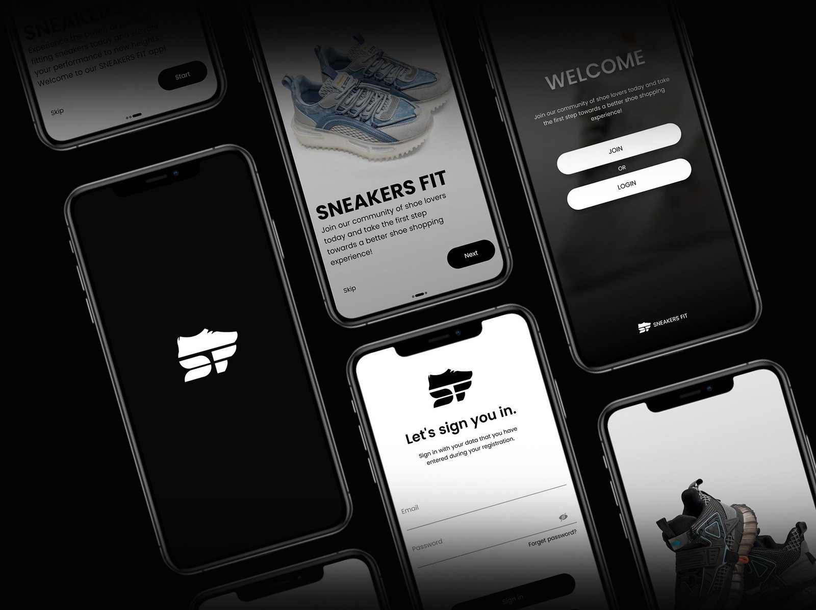
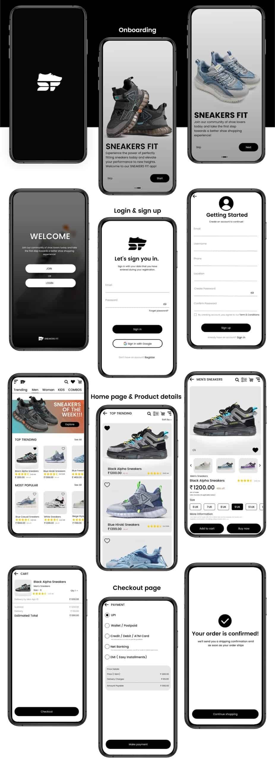
The Challenge
Groovy Beans Cafe's digital presence had gone cold, with a clunky interface and generic logo failing to mirror its vibrant, high-energy soul. Worexa fought to distill this artisanal warmth into a prestige visual identity while eliminating friction from the user journey. Our hurdle was replacing a static brand mark with a sharp, iconic symbol that commands authority and scales seamlessly from mobile screens to storefronts.
Our Approach
We optimized every digital touchpoint to mirror the bold, authoritative presence of the Sneakers Fit collection while replacing clunky navigation with an effortless, high-speed interface. Every design choice ensures the user journey feels as elite as a limited-drop release, balancing raw aesthetic soul with a high-performance backend as durable as the rubber on the road.
Key updates included:
The Outcome
After the Sneakers Fit transition
What We Delivered
"The new app perfectly captures the Sneakers Fit power. It looks high-end on the screen and feels even better during the scroll."
Kaelen R
Founder
"That iconic interface caught my eye immediately. The Sneakers Fit symbol feels like a true luxury mark that commands respect."
Soren V
Sales executive
"I love the sharp, symbolic app design. It gives the Sneakers Fit experience a premium soul that matches the elite quality of the kicks."
Liora K
Business executive