

- Your cart is empty Browse Shop
Groovy Beans: Sip the Rhythm
Translating high-energy cafe culture into an iconic visual mark and seamless digital customer journey.
The Challenge
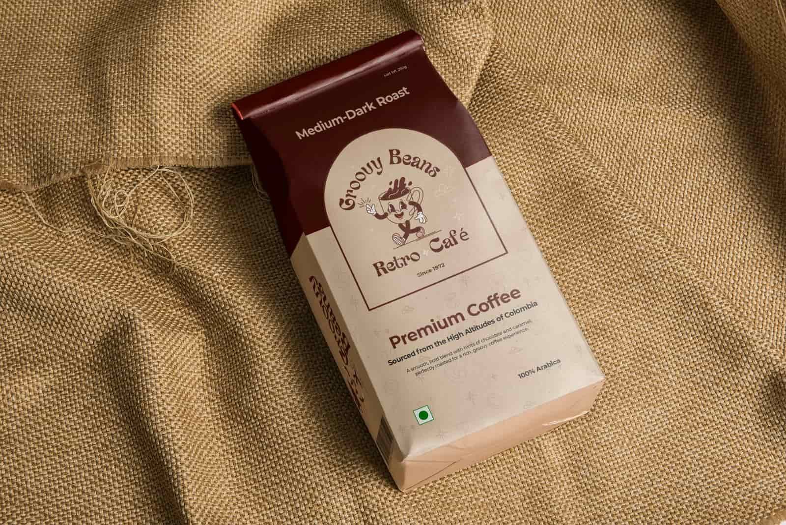
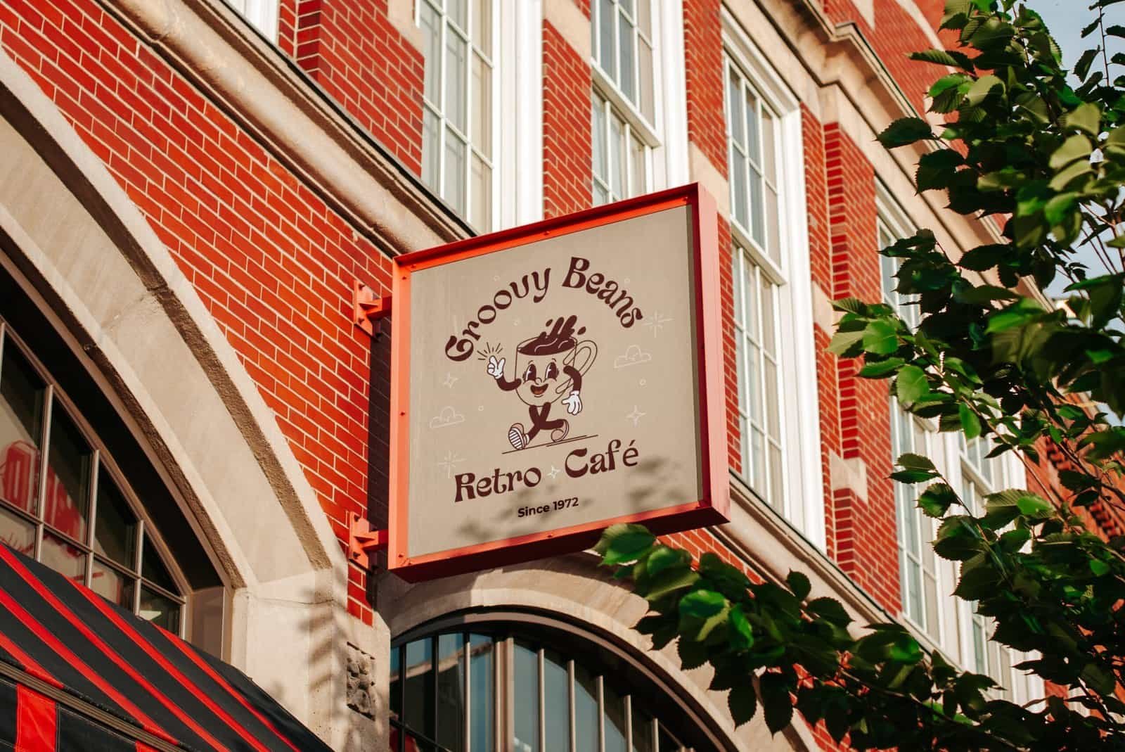
Groovy Beans Cafe’s digital identity had gone cold, stifled by a clunky interface and a generic mark that failed its vibrant soul, we fought to distill artisanal warmth into a prestige identity while stripping every ounce of friction from the user journey. The mission was to replace a static brand mark with a sharp, iconic symbol designed to command authority and scale seamlessly from mobile screens to physical storefronts.
Our Approach
We crafted a Prestige Identity and mobile-first UX that bridges the cafe’s high-energy soul with a Refined Interface. By prioritizing Smooth Architecture, we replaced complex navigation with a Frictionless Ordering System as seamless as the morning rush.
Key updates included:
The Outcome
After the new site went live, Groovy Beans Cafe saw:
What We Delivered
"The Prestige Identity perfectly captures the cafe’s high-energy soul. It looks incredible on the cups and the website."
Jordan M
Founder
"I love the Iconic Branding and the seamless UX. Ordering my coffee was faster than finding a parking spot."
Cassie L
Sales executive
"Finally, a Visual Mark is as premium as the coffee. The sharp, symbolic design gives the shop a massive authority boost."
Liam D
Business executive