- Your cart is empty Browse Shop
The Glow Essentials Identity Rooted in Radiance
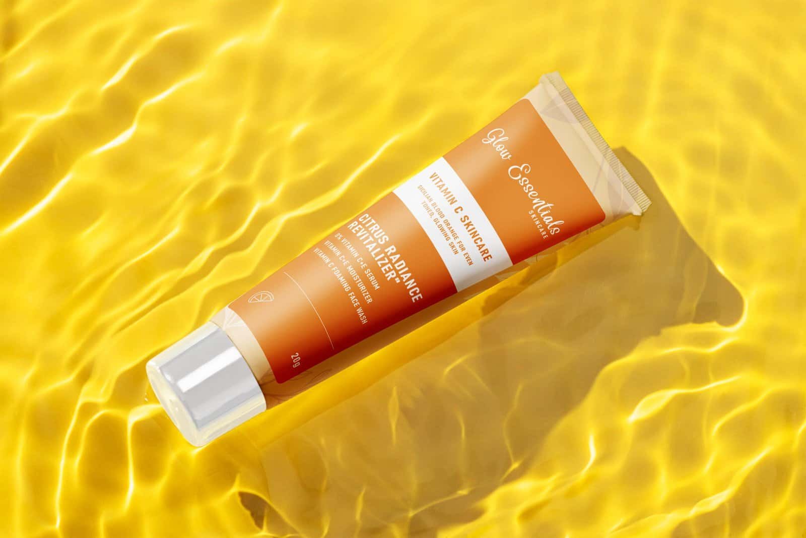
Refining the Glow Essentials presence through sophisticated structural design and sensory textures that command instant skincare authority.


The Challenge
We engineered a tactile revolution to house the luminous spirit of Glow Essentials. By neutralizing the friction between ethereal skincare aesthetics and the brutal demands of retail durability, we forged a packaging masterpiece. We didn’t just adapt a brand; we materialized a digital glow into a high-fidelity, physical legacy that commands the shelf and defies the noise of a crowded market.
Our Approach
“We embraced a philosophy of ‘less is more,’ using breathable layouts and a soft-touch palette to let the Glow Essentials purity shine. By selecting sustainable yet premium materials and high-definition print techniques, we turned simple containers into a sensory storytelling experience. This strategy focuses on quiet luxury, ensuring every touch conveys the elite quality and scientific precision behind the formula.”
Key updates included:
The Outcome
A high-performance identity engineered for trust, visibility, and retail dominance.
What We Delivered
"The packaging is stunning. Touching the Glow Essentials box feels like a spa experience in itself; the texture is so smooth and high-end."
Likhith Gowda S.
software developer
"The minimal design is so refreshing. It doesn't just hold the product; it elevates my entire Curated Shelf like a piece of art."
Arshad A S.
Sales executive
"I’m obsessed with the attention to detail. The gold accents and the crisp print make the brand feel incredibly expensive and trustworthy."
Pavan kumar R.
Business executive


