- Your cart is empty Browse Shop
Purity Unlocked: The Brave Munk Pack
Defining the brand’s raw essence through iconic packaging and a seamless physical architecture
The Challenge
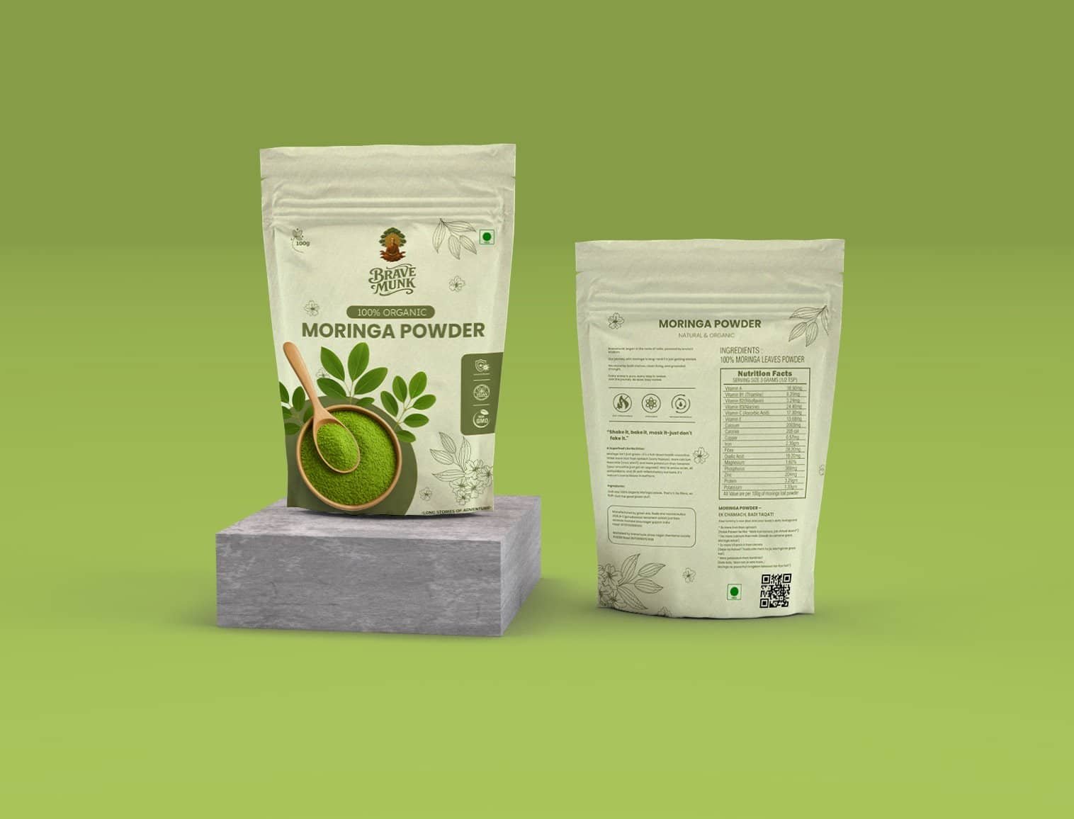
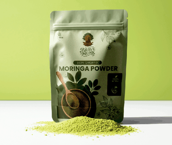
We materialized the raw, hyper-potent energy of Moringa into a high-fidelity packaging masterpiece. By neutralizing the friction of generic labeling, we engineered a visual identity that commands the shelf without diluting the brand’s organic soul. We didn’t just redesign a label; we codified a premium superfood legacy that finally matches the grit of the product itself.
Our Approach
We optimized every physical touchpoint to mirror the bold, authoritative presence of the Brave Munk harvest while replacing confusing information with an effortless, high-clarity layout. Every design choice ensures the customer journey feels as elite as the powder, balancing raw aesthetic soul with a high-durability finish as resilient as the Brave Munk mission it represents.
Key updates included:
The Outcome
After the Brave Munk transition
What We Delivered
"The new packaging perfectly captures the Brave Munk power. It looks high-end on the shelf and feels even better in your hands."
Michel
Founder
"That iconic branding caught my eye immediately. The Brave Munk symbol feels like a true luxury mark that commands respect."
John
Software Engineer
"I love the sharp, symbolic pouch design. It gives the Brave Munk Moringa a premium soul that matches the elite quality of the harvest."
Leo
Business Exceutive


